
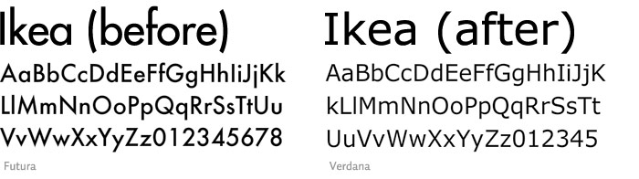
IKEA's signature Futura font has been replaced by the Verdana typeface this year. For 50 years, IKEA had been using IKEA Sans, a customized version of Futura font. In this year's 2010 catalogue, the iconic IKEA font is replaced by the ubiquitous Verdana typeface. Fans and designers are displeased with the change. On August 26, Romanian design consultant Marius Ursache even started an online petition to stop IKEA from changing the font.
Verdana was invented by Microsoft, first shipped with Internet Explorer 3 in 1996. It was intended to be used on screens, not in prints. Simon l'Anson, a creative director in London, said, "it has open, wide letterforms with lots of space between characters to aid legibility at small sizes on screen," but "it doesn't exhibit any elegance or visual rhythm when set at large sizes." "It's like taking the family sedan off-road. It will sort of work, but ultimately gets bogged down." Carolyn Fraser, a letterpress printer from Australia, said Verdana is "dumbed down and overused."
So why the switch? "It's more efficient and cost-effective," said IKEA's spokeswoman Monika Gocic. Verdana's ubiquity makes it easy for IKEA to use the same font everywhere in the world, and the online and print versions will be consistent.
Designers feel betrayed and dissatisfied with IKEA's motive. "They went cheap," said designer Iancu Barbarasa. "Designers have always thought of Ikea as one of their own, so now, in a way, the design community feels betrayed."
0 comments